How to Preview Documents with the Hover Panel
About the Hover Panel Component
-
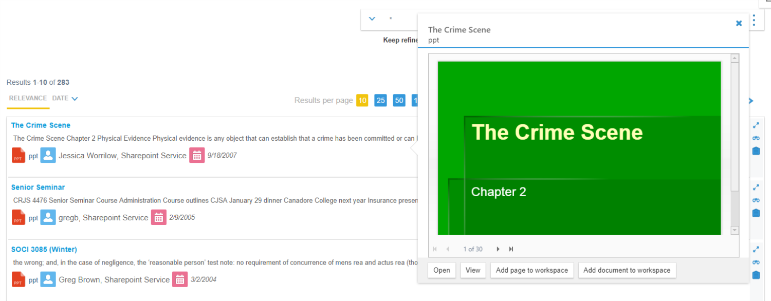
The Hover Panel component lets users quickly view a document preview when they hover through their SmartHub query results.
-
If Smart Previews is installed, the document preview is shown in the panel.
-
Otherwise, the panel displays the document metadata.
Example of a Document Preview

Example of a Document Preview with Smart Previews

How to Configure Your Hover Panel
Before continuing, familiarize yourself with the information in the topic How to Use the UI Builder.
UI Builder
-
The easiest and fastest way to insert and customize the HoverPanel feature is via the SmartHub UI Builder.
-
For more information, see How to Use the UI Builder.
-
SmartHub administrators can simply click the UI Editor link from the SmartHub Administration page.
-
Click the Select a page link from the top menu.
-
Select (double-click) an HTML page such as Results.html page.
-
Below, the Results.html page is shown for sample purposes.
-
BA Insight recommends you use page and folder to modify. Leave the default files as templates.
-
For example: Customizations/Results.html. Default Results.html is under the top most SmartHub directory.
-
-
-
Select the Advanced mode from the top right of the page.
-
Select Advanced settings edit.
-
Scroll down to line 216 (this may vary), which contains the text
SH.HoverPanel.CustomSettings
-
Click the Default Settings. A new browser tab opens with all available SmartHub module settings.
- Search for the word "HoverPanel" on the page to quickly navigate to the HoverPanel default settings, shown below:
- Copy the HoverPanel settings section from SH.HoverPanel.DefaultSettings.
- Go back to your Advanced settings edit tab.
- Paste the copied settings inside section SH.HoverPanel.CustomSettings.
-
EnableHoverPanelvalue is set to "false" by default. -
Modify settings as desired. See the "Hover Panel Settings" table below.
-
Click Save changes.
-
Click the link Preview <html> file.html at the top of the code editor.
-
Review your HTML page in the new tab that opens.
-
Make any necessary changes back in the code editor. Repeat steps 14-18 as necessary.
-
Click Save changes.
    SH.HoverPanel = SH.HoverPanel || {};
    SH.HoverPanel.DefaultSettings = {
        EnableHoverPanel: false,
        EnableHoverPanelForCBS: false,
        DisplayPreview: true,
        TemplatePath: SH.RootLevelURL + "/modules/HoverPanel/templates/template.html",
        ContentTemplatePath: SH.RootLevelURL + "/modules/HoverPanel/templates/defaultContent.html",
        CorrectionLeft: 0,
        CorrectionTop: 0,
        HoverSelector: ".sh-result-item", // For TabularView use ".k-master-row"; For CoveoResults use ".CoveoResult"; For ContentContainers use ".sh-result-item"
        CloseHoverPanelWhenHoverOver: ".coveo-header-zone,.header-info,.footer-zone,.sidebar",
        ViewButtonLabel: "View".toLocaleString(),
        ViewButtonTooltip: "Open in viewer".toLocaleString(),
        AddPageButtonLabel: "Add page to workspace".toLocaleString(),
        AddPageButtonTooltip: "Add this page to workspace".toLocaleString(),
        AddDocumentButtonLabel: "Add document to workspace".toLocaleString(),
        AddDocumentButtonTooltip: "Add full document to workspace".toLocaleString(),
        DelayTime: 300
}Settings Example
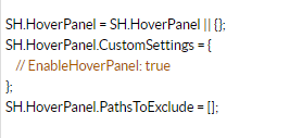
SH.HoverPanel.CustomSettings = {
    EnableHoverPanel: "true"};

SH.HoverPanel.PathsToExclude =[];
Hover Panel Settings
| Setting Name | Default Value | Description |
|---|---|---|
| EnableHoverPanel | false |
|
| EnableHoverPanelForCBS | false |
|
| DisplayPreview | true |
|
| TemplatePath | /modules/HoverPanel/templates/template.html |
|
| ContentTemplatePath | /modules/HoverPanel/templates/defaultContent.html |
|
| CorrectionLeft | 0 |
|
| CorrectionTop | 0 |
|
| HoverSelector | .CoveoResult |
|
| CloseHoverPanelWhenHoverOver | .coveo-header-zone,.header-info,.footer-zone,.sidebar | A list of class selectors that, when hovering over the elements with one of the specified class, the hover panel will automatically close |
| ViewButtonLabel | View | The label of the "View" button. |
| ViewButtonTooltip | Open in viewer |
|
| AddPageButtonLabel | Add page to workspace | The label of the "Add page to workspace" button . |
| AddPageButtonTooltip | Add this page to workspace |
|
| AddDocumentButtonLabel | Add document to workspace | The label of the "Add document to workspace" button. |
| AddDocumentButtonTooltip | Add full document to workspace |
|
| DelayTime | 300 | Number of milliseconds that you have to hover over an item in order for hover panel to be displayed. |
How to Show Different Metadata in Your Hover Panel
The default template can be found in the directory \modules\HoverPanel\templates\defaultContent.html.
- In order to customize the metadata shown, create a new HTML file in your customizations folder, and copy the content of defaultContent.html in it.
-
Modify the new template adding the following snippet for every metadata property that you want to show:
Copy<div class="hp-content-property">
<div class="hp-content-subtitle">
Custom metadata title
</div>
<div class="hp-content-property-value">
<%= resultItem.CustomMetadata %>
</div>
</div>Example of Custom Template
Copy<div id="<%= 'hp-metadata-container_' + elementId %>">
<div class="hp-content-property">
<div class="hp-content-subtitle">
Contributors include
</div>
<div class="hp-content-property-value">
<%= resultItem.DisplayAuthor %>
</div>
</div>
<div class="hp-content-property">
<div class="hp-content-subtitle">
Last modified
</div>
<div class="hp-content-property-value">
<%= new Date(resultItem.LastModifiedTime).toLocaleDateString() %>
</div>
</div>
<div class="hp-content-property">
    <div class="hp-content-subtitle">
        Custom metadata title
    </div>
    <div class="hp-content-property-value">
        <%= resultItem.CustomMetadata %>
    </div>
</div>
</div> -
Change the ContentTemplatePath setting to the path of the new custom template.
CopySH.HoverPanel.CustomSettings = {
EnableHoverPanel: "true",
ContentTemplatePath: "/modules/customizations/HoverPanel/templates/customContent.html"};
SH.HoverPanel.PathsToExclude =[];
How to Disable the Hover Panel Component
To disable your Hover Panel, use the following instructions:
- Follow steps 1-6 in How to Configure Your Hover Panel.
-
Change the EnableHoverPanel value to "false".
CopySH.HoverPanel.CustomSettings = {
EnableHoverPanel: "false"};
SH.HoverPanel.PathsToExclude =[]; - Click Save changes.